LOGO DESIGN: Authenticity vs Aesthetics and Trends
Designing a logo requires immense attention to detail—from picking colors and fonts to deciding on a symbol or mascot. A truly great design beautifully encompasses an organization's vision, mission, and raison d'être.
DESIGN EDITS
Helena C.
6/20/20265 min read
What is a logo?
The word logo originates from the Ancient Greek word "logos" (λόγος), which translates to "word," "speech," "reason," or "meaning"
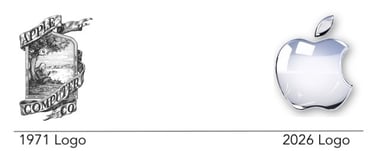
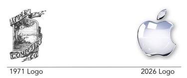
A logo, according to smart people, is the visual representation of an organization. It represents not only who or what an organization is, but also who the organization is to its stakeholders. An apple, without having to display an image, is a techbrand that has our photos and files in its cloud. However, to some, it is a fashion statement, or even a status statement. Whether seen as a tech brand or a "fit check item" depends entirely on who is interpreting. It contains not only the product, but also the market positioning of the brand, which has evolved over time.
Logos utilize memories attributed to certain colors, shapes, and symbols. Thus, culture, trends and history plays a part on how logos are perceived. This allows onrganizations to ride on a symbol's or colors inherent value and or appeal. However, it also because of this that some organization manage to fail significantly.
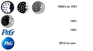
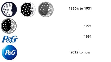
Example is Proctor & Gamble's 130 year old logo. During the 1980's Satanic Panic phenomenon in the United States, the company's long standing logo was interpreted as a satanic symbol. In response to this, the company had to send out over two million clarification packets, in an effort of trying to clear out their name. Over time, their logo evolved to what it is now.
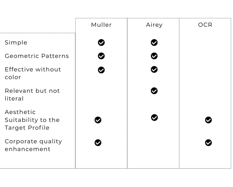
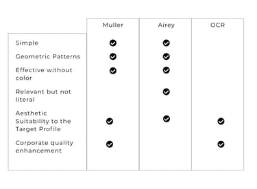
According to Jens Müller’s Logo Modernism, a logo must adhere to pure, reduced geometric parameters. Modernist design principles dictate that a logo should be built using basic shape structures. Adhering to circles, lines, or systematic typographic grids, creates a universally understood symbolic language.
This style avoids trendy or "cheesy" decorative effects. A good logo relies strictly on clean, crisp forms that carry enduring visual weight over decades, proving that a single well-placed vector is more powerful than a complex illustration.
Image Source: Logo Design Love (https://www.logodesignlove.com/logo-modernism)
Simple: It relies on a minimalist approach. A viewer should be able to process it fully in the single "second or two" they glimpse it while scrolling a phone or driving past a billboard.
Describable & Memorable: The geometry must be basic enough that you can easily explain the design to someone in words (e.g., "the Golden Arches")
Effective Without Color: The core silhouette must remain powerful and entirely legible when rendered in pure black and white.
Relevant, But Not Literal: It must match the tone of the industry, but it does not need to explicitly show what the company sells. As Airey famously notes, "The BMW logo isn't a car. The Nike logo isn't a shoe."
For David Airey on the other hand, a good logo design have the following characteristics:
Image Source: https://www.davidairey.com/project/haze-running
What makes a logo good?
A good logo seem to have a lot of design checkmarks to fulfill. However, The Cambridge OCR Branding and Corporate Design Guide strips away design theory and evaluates a logo like a technical product. In this curriculum specification, a logo is only good if it achieves fitness for purpose by answering a strict design brief. It must have
Aesthetic Suitability to the Target Profile: Colors, fonts, and moods must be scientifically aligned with the exact demographic and customer profile of the brand.
Corporate Quality Enhancement: The logo's typography and lines must actively elevate and enhance the perceived professionalism and specific atmospheric qualities of the business.
The Comparison Matrix: Müller vs. Airey vs. OCR
Logo design is indeed important. However, no matter how great a design may be, a logo can only be as great as the organization which it represents. It is important for a symbol that represents an organization to follow design principles and theories. In addition, it is also important that the design is relatable to its target audience.
A new organization with a fresh logo, or an old organization with an upgraded logo, will be perceived by its audience based on its overall branding. Its logo will be the anchor which allows people to remember the interaction and or experience. The target demographic will remember whether or not the quality attached to its logo is authentic or not.
A good and highly memorable design can either imprint a positive, lasting recommendation on a client, or conversely, drive them to avoid any association with the organization entirely.
Logo Design Conclusion
A good logo does indeed need to have good design. It has to be simple enough to be easily remembered; it has to look good in black and white; it needs to have recognizable symbols that can stand the test of time; it has to be honest.
A logo acts as an organization's banner and pride. It carries stories and experiences of people it has interacted with. Therefore, apart from having a good design, a good logo, first and foremost, has to belong to a good organization. It may seem anti climactic. But really, a good designer needs to have a sense of social responsiblity.
A logo that checks all the marks of a beautiful design but represents a company intended to scam people, is nothing more than a criminal organization's warning sign.
Designing a logo requires immense attention to detail—from picking colors and fonts to deciding on a symbol or mascot. This however is not enough. A truly great design beautifully encompasses an organization's vision, mission, and raison d'être.
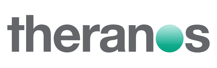

Image Source: https://1000logos.net/theranos-logo/
Design theory and design principles are tools that allow designers to fully translate an organization's "meaning" into art. Althoug it may be used as a tool to represent an organization beyond its intention, capabilities, and purpose, all it will do is frustrate client expectations and see it as a bad business with a beautiful logo.
DISCLAIMER: I am not in any way associated with UNIVERSITY OF CAMBRIDGE. Nor did I ask permission from them. This logo is directly sourced from CAMBRIDGE UNIVERSITY WEBSITE
Recommended Readings
As an Amazon Associate, I earn from qualifying purchases. This section contains products listed on Amazon, and links are my affiliate links. Every purchase made through these links gives me a small commission at no extra cost to you. Thank you very much for supporting my work!
Print Length:
Publisher:
Taschen
Date of Pub:
September 24, 2015
Dimensions:
14.65 x 9.69 x 1.6 inches
Hardcover
LOGO MODERNISM, Jens Muller
432 pages
LOGO DESIGN LOVE, David Airey
Paperback
Print Length:
Publisher:
Date of Pub:
Dimensions:
216 pages
Adams Media
August 1, 2011
7 x 0.42 x 9 inches
Get occasional updates on new travel galleries, design insights, and creative tools.
Whether you want to discuss a new brand identity project, look at custom travel prints, or just say hello, my inbox is always open.