CASE STUDY: Prima Real Estate
Prima Real Estate is a brand case study built around a family firm. The design emphasizes simplicity, data transparency, and premium structural clarity.
CASE STUDIES
Helena C
6/20/20262 min read
To create a minimal logo and cohesive business stationery suite that visually communicates what the company stands for, translating their core values of openness and long-term development into a premium corporate identity.
About Prima Real Estate
The Design Challenge
Prima Real Estate is a forward-thinking boutique property firm built on the pillars of openness, future-proofing, and scalable growth. They specialize in transparent and simplified processes, with direct-to-the-point transactions.
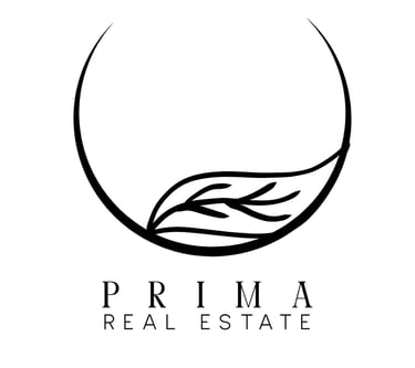
The Logo
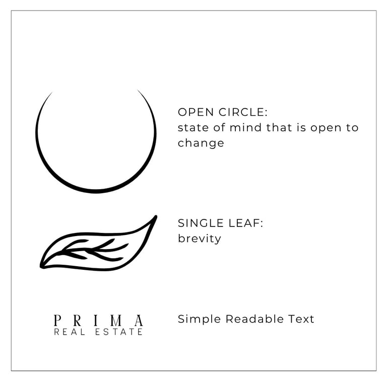
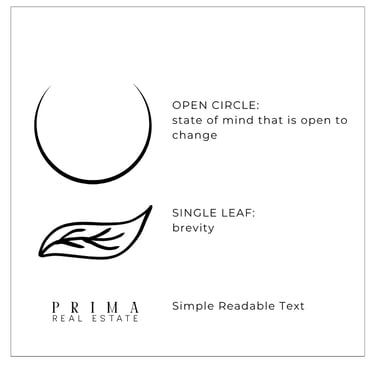
The idea is to design a logo that limits symbols and shapes to simple, identifiable elements. The proposed design is a combination of symbols and text, stacked together.The first symbol is an open circle, shaped as a crescent. The thinly drawn line represents both the crescent moon and the Asian symbol of an open circle.
The crescent moon popularly represents growth. On the other hand, the Asian open circle represents a state of mind that is open to change. This aims to present the brand as one that targets growth for its clients while maintaining a constant state of transparency. Open-mindedness is a core value the brand stands for, allowing clients to fully disclose any possible problems with their properties.
The other symbol is a single leaf, which in Asian culture signifies brevity. This aims to represent how the company deals with things—simple and direct-to-the-point.
Visual Versatility
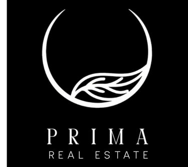
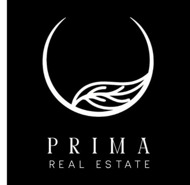

A truly enduring visual identity must perform flawlessly across different applications. By implementing a high-contrast palette, the logo maintains its stark, premium clarity whether set against a deep black canvas or a clean white background.
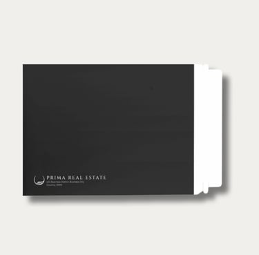
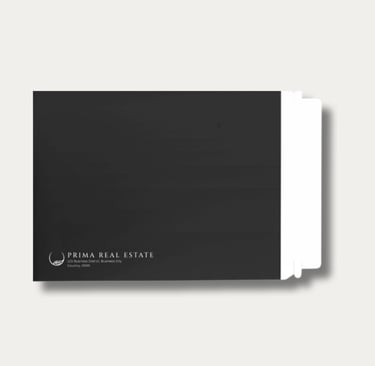
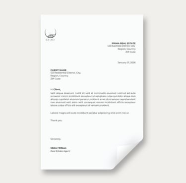
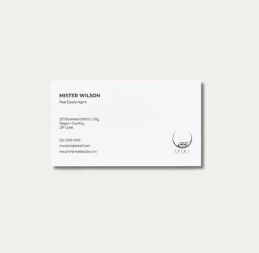
Business Stationeries
The business stationery suite was intentionally designed with a minimalist aesthetic to reflect the company’s client-first philosophy, stripping away unnecessary visual noise to focus purely on essential information.
Envelope. Real estate transactions inherently demand confidentiality. To honor this privacy, a premium black envelope was created specifically for secure documentation and high-value client correspondence.
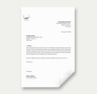
Letterhead. The corporate letterhead uses a clean, formal layout to signal the serious nature of institutional conversations, reinforcing that the company treats every transaction with absolute dedication.
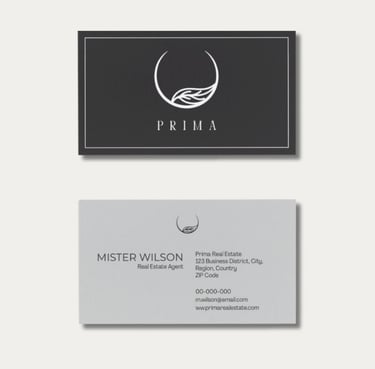
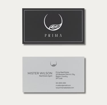
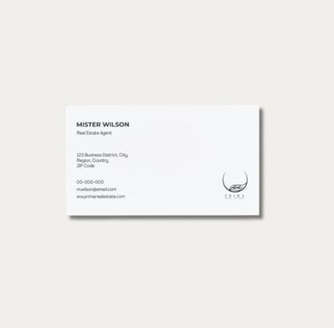
Business Cards. Two distinct layouts were created for different networking scenarios. The double-sided card embraces modern design standards, engineered as a premium artifact to hand directly to high-value clients. Conversely, the single-sided card uses a name-first layout hierarchy, specifically designed to remain highly legible when cataloged or filed away for future reference.
Get occasional updates on new travel galleries, design insights, and creative tools.
Whether you want to discuss a new brand identity project, look at custom travel prints, or just say hello, my inbox is always open.